Wednesday, 8 September 2010

Personalisation fail

We received a pen in the post today. Nothing unusual about that, I’m sure we've all received countless offers to personalise our corporate stationery.

What makes this pen extra-special is that it has a photo on it as well as our logo and address. The sender is obviously trying hard to win our business; it was after all “a labour of love and I hope you agree it looks terrific”, says the covering letter.

In its endeavour to send us something that was truly unique, it took an image from our website. That honour goes to Richard Dalziel—one of our unsuspecting independent contributors who, according to this particular stationery supplier, is now the face of our brand.

Moral of the story—if you’re going to try your hand at personalisation, first do your homework about what you are going to personalise.—MT

Friday, 3 September 2010

August Catalogue Log

Last year, the fact that we received just 71 catalogues in August seemed unusual to us. But this year, receiving just 61 catalogues in August came as no surprise. We have been tracking a steady decline in catalogue volume during the last few months—the only anomaly being July, when sale activity boosted the number of catalogues to land on the Catalogue Log desk.

Comparing the catalogues received in August 2009 with those logged in August 2010, some titles that appear in both columns, such as Books Direct, House of Bruar and Scotts of Stow. There also seemed to be an almost equal number of new names this year to compensate for lists we have been dropped from. This further cements the theory that cataloguers are mailing smarter, removing unprofitable names from their files.

Cataloguers are also becoming smarter with their covers. We have been tracking how many catalogues highlight a sale or discount, free shipping, or a free gift on their covers since January 2009 and have noted an increasing trend of using the cover to promote some sort of offer. A staggering 65.6 percent of all the catalogues we received in August featured some sort of offer on the front cover—in July that figure was 64 percent and in June it was 60 percent. Among the minority of catalogues without a special offer were Brora, the Dolls House Emporium, and Lakeland.


The most popular offer in August was a sale or discount, promoted on 41 percent of the catalogue covers we logged. This is appreciably lower than July’s record high of 49.5 percent. Gaining favour with cataloguers in August was free delivery—the number of catalogues touting free shipping almost doubled from 12.1 percent in July to 23 percent in August. Catalogues offering free delivery included Bon Prix, Joules and Boden, which repeated its Sunday Times offer of last year—a 15 percent discount, free delivery, and free returns. We thought it made Boden look needy last year, but it obviously works or Boden wouldn’t have used it again.

The number of catalogues offering a free gift with purchase was 11.5 percent, down from 12.1 percent in July and from 14.1 percent in August 2009. Free gifts were mainly promoted by the b-to-b catalogues in the pack including Viking Direct and Neat Ideas.

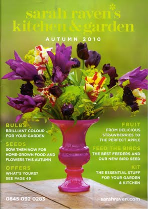
Our favourite offer of the month is from gardening catalogue Sarah Raven’s Kitchen & Garden. Among the messages on the cover was this: “Offers What’s yours? See page 49”. I thought it was a fun way to encourage customers to flick through the catalogue. It also had a sense of personalisation—did my catalogue have a different offer to my friend or neighbour’s? I’d like to think there was some sort of segmentation that went into deciding which offer to send to which tranche of the database. Let's put it to the test, I got 15 percent off. What did you get?--MT

It’s our 15th birthday--take 15% off

Subscribe to Catalogue e-business during September* and you’ll receive a 15% discount.

The September 2010 issue of Catalogue e-business is out now and it’s an extra-special one; not only is it jam-packed with the latest tactical advice for multichannel retailers, we also have the bonus ECMOD Preview2010 supplement.

Subscribers can look forward to:

* The Green Issue: the mail order sector doesn’t fare well when it comes to appearing “green” —here's what you can do to combat that, plus tips on sustainable print buying that won’t cost you the earth and a Q&A with Celtic Sheepskin’s general manager Karl Headleand.

* Small-business spotlight: how to use video on your website.

* Contact centres and customer service: is “self service” just an excuse for poor customer service?

* Bonus ECMOD 2010 Preview supplement: increasing sales through Google Analytics, managing your multichannel marketing investments, making sense of order allocation, and news from the exhibition floor.

* Plus: the latest industry news, a review of the Magicbox website, and a Q&A with Patricia Watson of Able2 Wear.

Don’t subscribe? September also sees us celebrate 15 years of Catalogue e-business, so for those of you that aren’t familiar with the publication, or what we have been offering our loyal subscribers all these years, we’ve come up with a very special offer.

Subscribe to Catalogue e-business during September* and you’ll receive a 15% discount. That’s right—you’ll receive a year’s worth of issues, plus all our supplements and full access to our website for just £72.25 in the UK or £80.75 for an international subscription.
To guarantee your copy, subscribe today by calling 01271 866221 or emailing our subscriptions department, remember to quote the code “Happy Birthday”. Offer ends 30th September.

---
* New subscribers only, does not apply to renewals. Companies that already have a subscription can take up the offer by taking out a new subscription for a different named contact.

Tuesday, 31 August 2010

How not to relaunch a website

This weekend I received an email from a mail order company that will remain nameless. Its title was “New Website - Now Live! PLEASE READ”. Sounds scary, doesn’t it? It gets worse: “The new website may take up to 24 hours to become available online while the new site registers across the internet. If you still see the temporary page this is because it has not yet updated on your ISP's nameservers.” Say what?

Followed by:“Unlike previous websites our new website is completely automated. Please ensure your orders are correct when you place them as we may not be able to change them at a later date if an error is made prior to goods being despatched.”

This is wrong on so many levels. First, if the website hadn’t updated “on your ISP’s nameservers” why was this company promoting the relaunch? Seems strange that it would publicise a launch when it wasn’t confident that the site was truly live.

Second, adding that the website is now “completely automated” seems redundant to me. What did customers do before? Did they shop online, realise that they bought the wrong size or colour and then call up to change orders after they were placed? It must have been a common problem for the company to address it in a serious-looking plain-text email.

Third, the tone is all wrong. You’d think that relaunching a website would be a happy occasion with plenty to shout about. But this email doesn’t tell me why I should buy from the new site. There are no details on the new site’s features, nor is there any sort of offer to tempt me to click through.

What I would have suggested is soft-launching the site. If the bank holiday is a key sales period, it would have made sense for the site to go live earlier but without fanfare. That would have given the retailer enough time to fix any bugs before the important weekend. It could then follow up with a much more appealing email complete with images and a bit of information on exactly what was new—something that was sadly lacking from this email.--MT

Thursday, 26 August 2010

Compare and contrast--Simply Be

In June, we reported that UK-based plus-size apparel catalogue Simply Be was crossing the Atlantic to launch a US catalogue and website. The American website has now landed and an autumn (or rather Fall) catalogue is in the mail. So apart from the wording of the seasons, what else is different?

Although the home pages of the UK and US sites are fairly similar, there are subtle differences. First, Simply Be’s international sites (for the US, Germany, and an English-language euro site) are all built on the Venda platform, whereas the main site displays no developer/vendor logo. The UK site (below) also has no favicon. The international sites do.

Whereas the US site (below) has just one horizontal navigation bar along the top of the page, the UK home page has two. UK shoppers can click through to the categories of Fashion, Accessories, Sport & Swimwear, Lingerie, Footwear, Home & Garden, Electricals, and Gifts. Below that are links to New In, Designers & Brands, Style File, Editors [sic] Notes, and Sale. The US site only gives the options of Apparel, Lingerie & Sleepwear, Shoes, Accessories, and Active & Swimwear. The UK left-nav bar also has more messages than its American counterpart—it calls for votes in the Company Fashion Awards.

Another difference is that the UK site has two main images on the home page, whilst the US has only one. The established UK site is promoting its ranges for autumn, emphasising new trends. The US site, which has only just gone live, is going for a more generic approach and is mainly promoting the company’s newness: “From Britain with love…Fresh, fabulous and right here in the USA!” Is this an indication that Simply Be is taking a leaf out of Boden’s book and using its Britishness as part of its appeal?

Links to Simply Be’s social-networking presence—a Twitter feed, a Facebook page, a blog, and a YouTube channel as well as links to Simply Be’s international sites—are present on both sites. Noteworthy, however, is that the blog link takes both American and British shoppers to the same page; other etailers, like The Book Depository, have different content for different regions. Simply Be’s recent blog post are all aimed at a UK audience—promoting the Company Awards, shining a spotlight on the latest UK TV ad, and writing about the Simply Be model competition, which as far as I can tell, is only open to UK entrants. I also tried clicking through to the blog from Simply Be’s German site, which launched in 2009. Once again, it was the same, UK-focused blog and I couldn’t see any references to its German shoppers or its activity in Germany. From this I gather that Simply Be will probably not embark on writing a US-focused blog.

Navigating around the site
Both the UK and US sites have their search bar in roughly the same position on the site. As I didn’t have anything specific in mind, I headed for the Fashion category on the British website (above) and the Apparel category on the American site (below). I was greeted with very different pages: The UK site took me to a dynamic page where, when I hovered the mouse cursor over a category, a corresponding image was displayed on the left. The bottom of the page also has a sliding carousel showcasing other “new-in” items. The US site also has a slideshow of items, but it’s not as dynamic as the British equivalent. Also, the Apparel landing page has much smaller images than the UK site. And did you notice the name of the page? “European designs womens apparel”— putting emphasis on its links to Europe and high-fashion.


I selected the Jersey Drape dress—an item available on both sites—in order to make a comparison. To change from sterling to dollars, Simply Be doubles the price—a £27 dress becomes $54. The copy is almost the same, but the US site states the item is imported and does not give the garment’s length in the product description, though it is included in the item’s title. When it comes to zooming in on the item, both sites offer a zoom function, though I would have liked to see a larger picture, as the image at 100 percent was not big enough to see close-up detailing.

Although both sites require a log-in to get into the checkout, neither sets out which payment methods are accepted before an account is created. In the interests of transparency, Simply Be should perhaps consider displaying payments methods (such as credit card, debit card, PayPal, customer account) somewhere on the home page.

The fully fledged US Simply Be website has only been live for a fortnight or so and I’d be interested to see whether it evolves at the same pace as its older sister, or whether, given the opportunities a US market opens up to Simply Be, it will soon overtake the British site in terms of traffic and functionality.--MT

Tuesday, 24 August 2010

Huh of the day: Carr and Westley

I feel like I have been transported back in time. It’s not because the clothing range of Carr & Westley is reminiscent of a bygone era, it’s because the entire catalogue is in black and white. Well, apart from the red “save ££” signs plastered all over it.

Black and white? I don’t get it. When buying clothes, the first barrier to purchasing by mail order or online is that you can’t try the clothes on. The second barrier is not being able to see enough detail—and colour is top of that list.

I suspect that printing in two-colour is cheaper than four-colour, but with a fashion catalogue this could be a false economy. Customers need to know the colour of the garment—in black and white they can’t see the difference between “dusky” and “blush” pink. How red is the red dress? And am I the only person that had to look up delft blue?--MT

Monday, 16 August 2010

Compare and contrast: Lands’ End

This week sees Lands’ End launch its kidswear range in the UK, so as you would expect, the UK home page (http://www.landsend.co.uk/) calls out the new line. In the US, however, Lands’ End (http://www.landsend.com/) has been selling childrenswear for some time (about 20 years!), so it doesn’t need a big announcement. Yet, it is the US site that features childrenswear most prominently on the home page with its 25 percent off back-to-school.
The UK site (above) devotes most of the home page’s prime real estate to the new autumn collection: “Introducing new styles you’ll love to layer”. It has a strong call to action: “Autumn’s so easy to put together! Shop now”. Further, below the main images is a rotating special-offer banner promoting free delivery on orders of £75 or more, and a reminder to shop the summer sale.

Below the banner are four boxes: Information about Lands’ End famous guarantee, an invitation to sign up to emails, catalogue request, and a link to find out more about Lands’ End gardening project, opened in July at Barnsdale Gardens by Tim Curtis, the managing director of Lands' End UK. The link to the gardens takes users to the Lands’ End blog, where they can view ten photos from launch day. A nice touch about the links on the home page is that they are all dynamic; when a user hover his mouse cursor over the box, the copy “moves up” to show more. Lastly, the home page features links to the about us, special services and customer services pages, as well as to clothing departments and to Lands’ End presence on social-media sites.


In contrast, the US site’s home page (above), has a lot less going on. The site is wider (a scroll bar appeared on my screen to move it from left to right—this was not present on the UK site). It has one main image instead of the UK site’s two. And it has one main message—“25% off back-to-school. Everything you need to get back to class in style”. Below the main image is a static banner promoting overstocks of up to 65% off. Personally, I like the UK’s summer sale banner better. Calling it “overstocks” has connotations that Lands’ End overordered and is left with lots of unwanted items. Summer sale sounds more “fun”—the last opportunity to enjoy summer before the knitwear and scarves come out to play, or a chance to grab a bargain before heading off for more sun in warmer climes.

The US site lacks the dynamic links of its UK counterpart, instead it has a blue box with information on customer services. Where it trumps the UK site is that it has Chat Online and Call Me functions. Overall however, the UK site is more social—the US website only links to Facebook from the home page and curiously, the link to its Twitter feed (http://twitter.com/LandsEndChat) can only be found on the Newsroom page. A missed opportunity to connect with customers?

Looking at the categories, Lands’ End US has more on offer—it breaks down its departments into men, women, girls, boys, swim, outerwear, shoes, school uniforms, for the home, luggage, overstocks, and Lands’ End Canvas—a seemingly younger-skewing Lands’ End subbrand. The UK site keeps its simple: women, men, swimwear, jackets and coats, footwear, girls, boys, and sale. (I found it a little odd that the US calls it “outerwear” but “shoes”, and the UK “jackets and coats” but “footwear”.)

Moving inside

Because the terms for the departments were so different (“pants and shorts” together in the States, but “trousers and jeans” in the UK) I typed cardigan into the search bar, which was reassuringly located in the same place on both sites. I was greeted with an almost identical results page and picked the Women's Blissful Draped Cardigan. In the US it was priced from $29.50; UK price £25… but let’s not dwell on that. Both sites offer a choice of ten colours, but again, the US site goes one better and displays a rating next to the product description. On the product page itself, the British site still features no ratings or reviews and there are subtle differences in copy. Guess which is for an American audience and which is for the Brits? (Answer below)

1.) A lightweight complement to just about everything.
Soft, feathery-light jersey knit
Blend of cotton and polyester keeps its shape, shrugs off wrinkles
Graceful draped collar
Easy-moving raglan sleeves
Falls to low hip
Fit 1: Modern. Fitted through the body; never too tight, definitely not boxy. Plus sizes are Fit 2: Original. Not too slim or too loose

2.) A lightweight cardigan to complement just about everything.
Soft cotton/polyester blend knit – keeps its shape, shrugs off wrinkles
Graceful draped collar
Easy-moving raglan sleeves
Falls to low hip
Fit 1: Modern – slimmer through the body; not too tight. Plus sizes are Fit 2: Natural – not too slim, not too loose
Ultimately the product pages show brand consistency, but why the UK site, which has done so well up to now engaging its customers through a blog, on Twitter, and on Facebook, should omit product reviews is a bit of a mystery.

Mix and match
Lands’ End is one of those cataloguers that gets it right—not least because its brand is world famous for its exemplary customer services. I also know that Lands’ End tests everything, so I assume that accounts for the subtle language differences. Clearly though there are some things the UK site does better than the US. The creative and dynamic imaging on the home page are more engaging for a start, and the social media links show a desire to keep in touch with customers. However, Lands’ End US actively invites live chat and customer reviews, so each could learn a little from its counterpart across the Atlantic.

And the product copy? The first example is from the American website (below). Though I would have expected more info from the UK site considering there are no user reviews to really describe how the product looks and feels.--MT